


A Facebook Designer Creates the Most Delightfully Absurd Way to Tell Time
Jesus Diaz
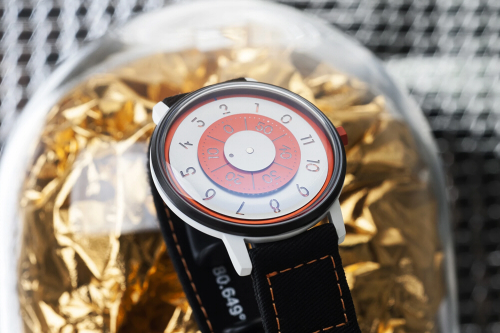
Analog watches use hands to point at numbers. The small hand marks the hours and the long one marks the minutes. Depending on their position, our brain interprets the time. It’s pretty logical, easy to do, and well, screw all that, because the Redundant Watch’s hands point at yet more hands to make your life a little bit harder and, hopefully, a bit joyful every time you look at it.
The playful watch was designed by Ji Lee and available now on a Kickstarter campaign.
Lee – communications designer at Facebook and former designer and creative director at Google Creative Lab – told me via email that the design goes back to 1993, when he was attending design school. “The assignment was to design a unique clock. For days, I struggled to come up with anything interesting because there were so many amazing designs for a clock already,” he says. Then he thought about doing the most obvious and redundant thing possible – showing the positions of the arms instead of the numbers for each hour.
He made a prototype, which he published on his public portfolio. Blogs covered the clock, and people started to approach him to buy it. Four years ago, he says, someone else made an actual clock based on his design and it went viral on Reddit. That’s when he realized he should turn it into a commercial project and successfully launched it on Kickstarter back in 2017.
The Redundant Clock is no longer available but, a year ago, Anicorn Watch approached him to create the wristwatch version of his Redundant Clock. The Hong Kong-based manufacturer of whimsical watches wanted Lee’s design to become one of their Trio of Time models, a collection of watches from designers around the world.
But shrinking a 12-inch diameter wall clock down to a 40-mm diameter wristwatch was no small feat, as Anicorn founder Joe Kwan explained over email. They had to scale all the elements down, while keeping the details of all 12 hours. The size also made it harder to place extensive graphics on the sphere while maintaining readability. Anicorn revised the prototype four times together with Lee, he says.
The final result feels worthy of Marcel Duchamp, a graphical joke that subverts all convention. But it’s more than just a joke. In introducing a layer of friction to the otherwise simple act of telling time, it forces you to stop and appreciate the moment – something that’s harder to do in the age of smartphone-enabled instant gratification.
This is part of a larger trend against minimalism, as designers increasingly embrace expressionistic ways of interpreting the world around us. The Redundant Watch probably wouldn’t have survived a second in the hands of Jonathan Ive and his cronies. We, on the other hand, want one.